Spring/Summer 2026: Pantone’s Colour Trends That Are Shaping Fashion
stylememoore1
Jan 20
2 min read
As fashion continues to evolve beyond mere aesthetics, colour has become a language of mood, identity, and personal storytelling. For Spring/Summer 2026, Pantone’s Fashion Colour Trend Report celebrates this narrative, presenting a palette that’s at once expressive, optimistic, and versatile, perfect for designers, stylists, and fashion lovers looking to refresh their seasonal wardrobes.
Pantone’s Color of the Year 2026 is Cloud Dancer, a soft, ethereal off-white that marks a bold departure from vibrant hues. It’s described as a neutral with an “aerated presence” evoking clarity, calm, and a fresh start amid the sensory overload of modern life. This quiet elegance makes it ideal for minimalist silhouettes, breezy linens, and head-to-toe tonal looks. Expect it in capsule wardrobes, breezy shirting, and as a backdrop that allows other colours to pop. It’s tranquil yet sophisticated — a colour that speaks without shouting.
The Core Spring/Summer 2026 Palette. Bold Meets Soft
Pantone’s Spring/Summer 2026 palette delivers a dynamic mix of energetic accents and grounded shades. This collection reflects a season where confidence and personal expression take center stage.
Key Standout Hues:
Acacia – A vibrant yellow with green undertones, bringing sunshine and vitality.
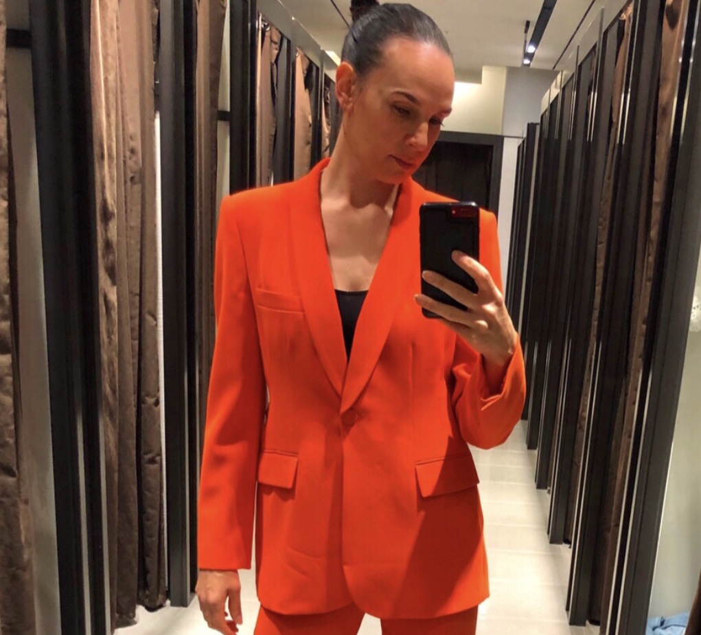
Muskmelon & Mandarin Orange – Juicy, fruity oranges that evoke warmth and zest.
Burnished Lilac & Amethyst Orchid – Smoky lavender and luxurious purple add a dreamy, poetic feel.
Lava Falls – A rich, dramatic red that’s bold and passionate.
Tickled Pink & Dusty Rose – Flirtatious pinks bridging sweetness with strength.
Alexandrite – A deep teal that’s both glamorous and mysterious.
Burnt Sienna – Earthy and grounding, ideal for tailoring or leather pieces.
This palette dances between exuberance and introspection, giving designers (and wearers) the tools to mix and match moods, from punchy pops to serene accents.
Neutrals & Seasonless Anchors
Beyond brights and bramble tones, Pantone highlights neutrals that provide foundation and balance, perfect for building versatile, everyday wardrobes. Think Coffee Bean (rich brown), White Onyx (off-white), Sage Green, and Sycamore (a deep forest green). These shades aren’t merely background; they’re the base that lets other colours sing.
Why These Colours Matter in 2026
The SS26 palette reflects a deeper cultural shift, from hyper-saturation toward thoughtful self-expression. Colours aren’t just pretty; they’re emotional tools. Soft neutrals soothe, bold pigments invigorate, and earth tones connect us back to nature. Together, they create a visual language that’s expressive yet wearable, adventurous yet grounded.
Whether you’re scouting pieces for your spring closet, planning your next capsule wardrobe, or seeking imagery for your next shoot, these colours offer endless inspiration across contexts.


Comments